Habit Tracker Mobile app UX/UI
As a component of the larger $4.5 trillion wellness market, habit tracking apps have carved out a significant niche, serving an estimated 75 million users worldwide as of 2023. They are on track to see substantial user growth, reflecting the shifting priorities towards self-care and productivity enhancement.
Project Background
Project Details
To create a mobile app that not only assists users in cultivating positive habits through pattern recognition and repetition but also provides support for breaking unhealthy ones. One of the goals was to create a design that would look equally good on smaller phones such as the new iPhone SE.
My Roles & Responsibilities
As the sole product designer for this project, my responsibilities included:
Conducting benchmarking research to understand industry standards and user expectations.
Facilitating features prioritization based on user needs and project goals.
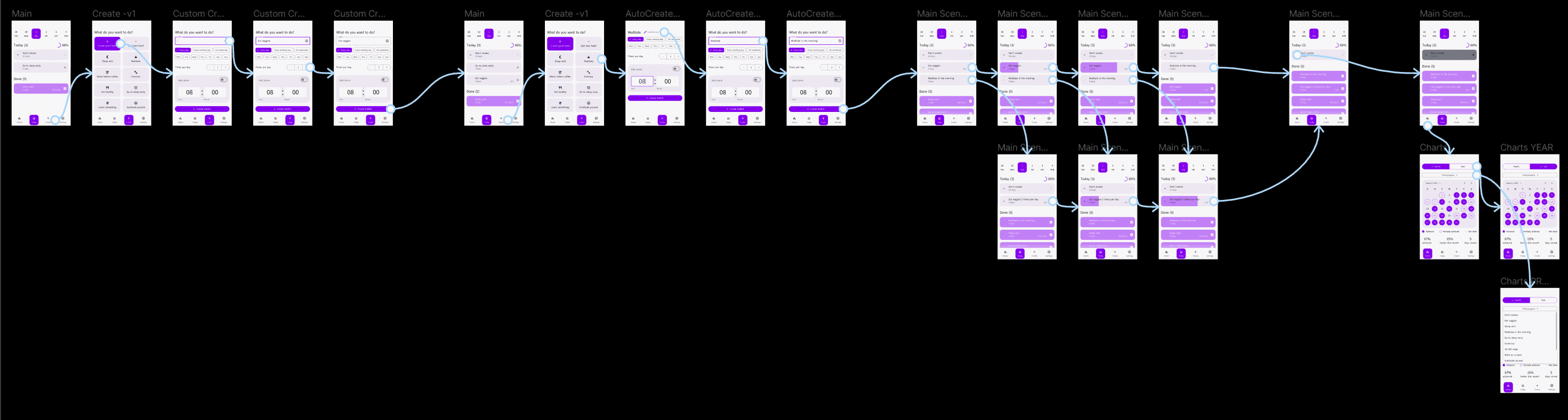
Developing screenflows and initial UI design.
Reviewing design feasibility through tech reviews with developers.
Conducting UX tests of the Figma prototype for feedback.
Creating the final UI designs for the app.
Navigation
Benchmarking
In the initial stages of benchmarking, I identified competitors to analyze their screenflows and establish primary research questions.
Who are our main competitors?
What features are must-haves, and what will be an advantage?
To answer this questions, I have collected the screenflows of main competitors and compared them to understand industry standards and user expectations.
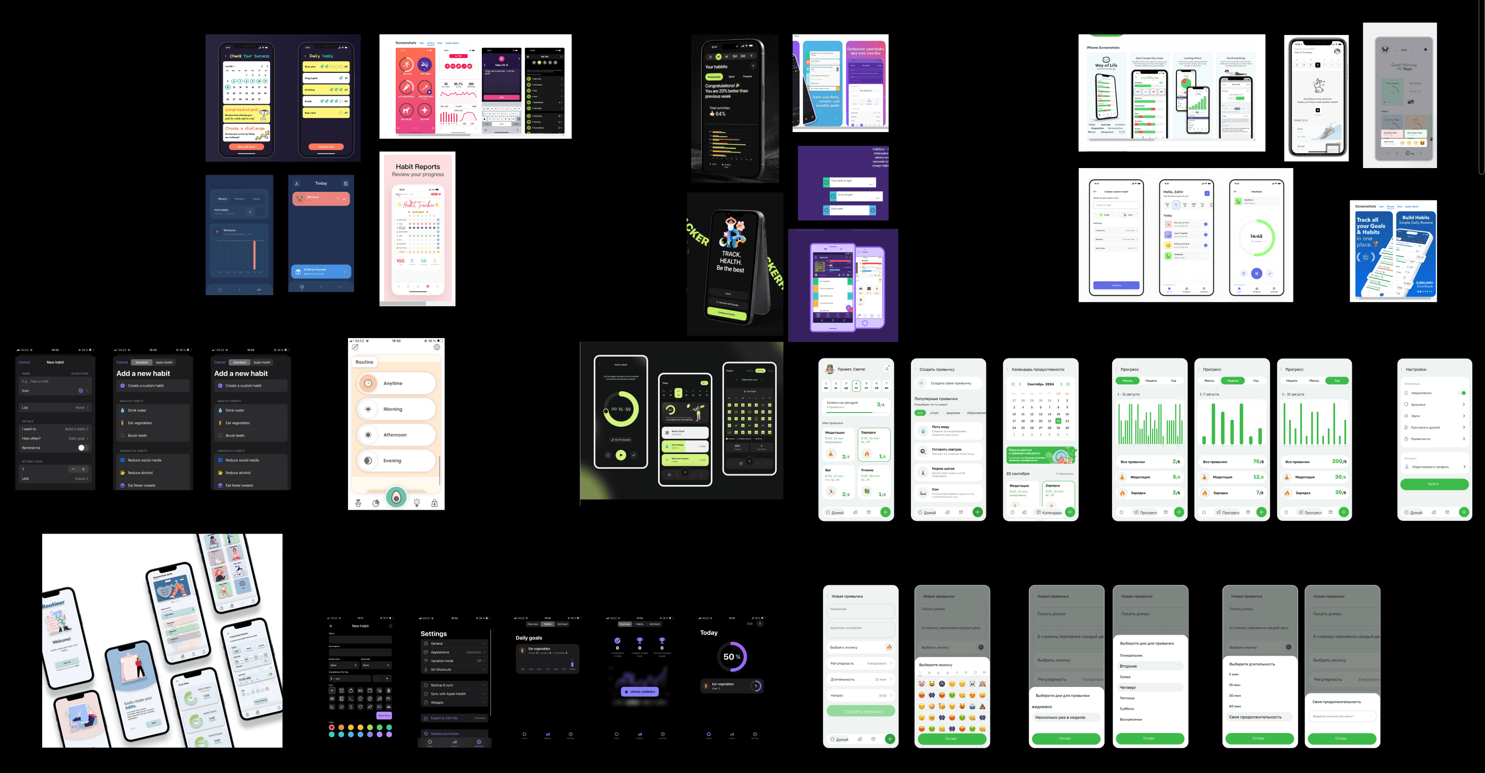
Features overview on the market
Basic
Advanced
Unique
All competitors already offer
Cultivating a positive habit
Repeating a task more times per day
Social experience
Gamification
Synchronization with smartwatch/tracker
Quitting a negative habit
In-built diary/gratitude journal
Account settings
In-built timers
Offered by 50% or less competitors
50%
30%
30%
25%
Offered by 1-2 competitors
After benchmarking research I got unexpected results that gave a deeper understanding on features prioritization.
Screenflow + First Iteration UI Design
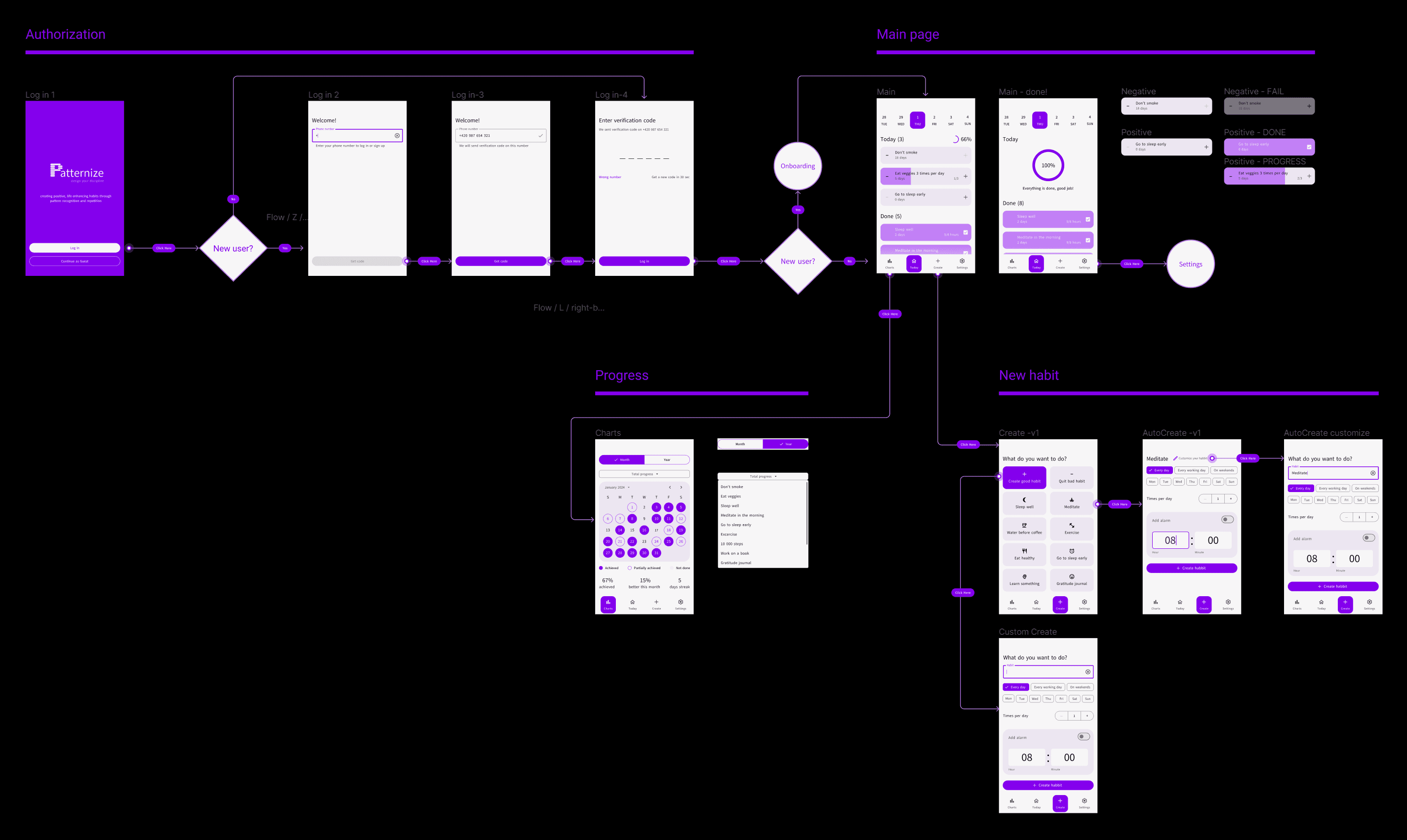
Screenflow was built to see the entire scenario from start to finish and check if I missed anything, placing wireframes there so that both product managers and developers could conveniently read the logical scheme.
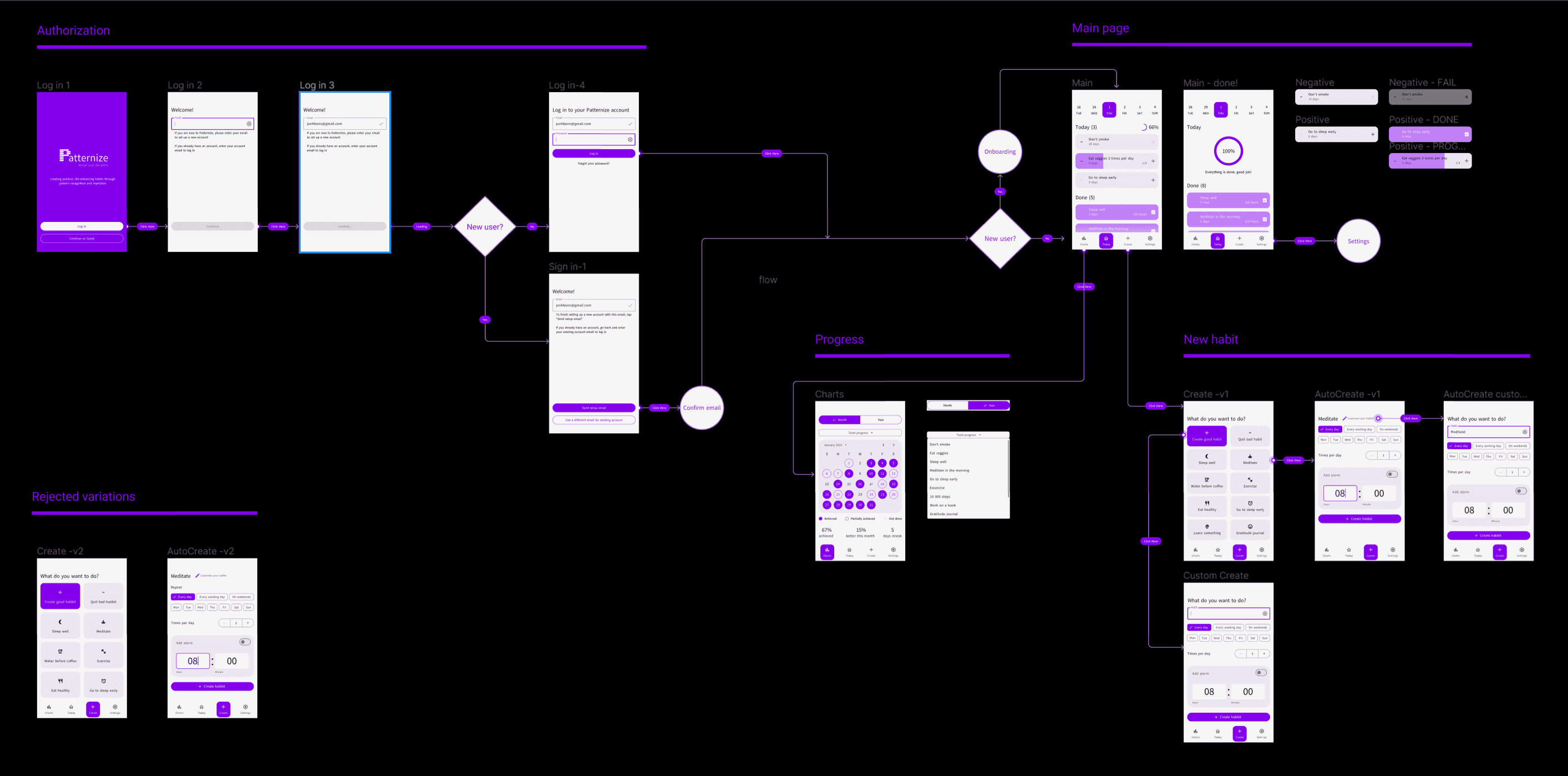
Technical Review
Working closely with developers, I fine-tuned UI design during the technical review phase. We made some practical changes that improved the user experience.
switched from email to phone number login, cutting down 3 unnecessary screens.
standardized the design and navigation of different task styles, which proved beneficial during user testing
added different input and button states
and a few other minor changes to the UI
After implementing the discussed adjustments to our UI design and screenflow, I transitioned to creating a Figma prototype and conducted user testing.
User Testing
Usability testing of the prototype of a new mobile application
The research methodology:
Testing is conducted online on the respondent's device (mobile interface).
A total of 9 tests to conduct, each test session lasts for 15 minutes.
Testing process
Scenario 1:
Starting on the main page. Imagine, you want to add a new habit “Eat veggies 3 times per day”. What will you do?
Hypotheses:
The user will understand that by clicking “Create” in the navigation, they will proceed to create a new habit
The user will understand they can choose from suggested habits or create their own - positive or negative
The user will understand that they can choose to repeat the habit multiple times a day
Scenario 2:
Starting on the main page. Imagine, you want to start meditating on weekends, but you want the habit to be called “Meditate in the morning”. What will you do?
Hypotheses:
The user will understand that they can change the habit's name by clicking on “Customize”
The user will understand that the chips are responsible for the frequency of the habit, and they can choose to repeat it every day, every workday, or every weekend, or select specific days of the week for the habit
Scenario 3:
Starting on the main page. There are your habit “Eat veggies” (repeating 3 times) and habit “Meditate in the morning”. Imagine, you succeeded in both today. What will you do?
Hypotheses:
The user will understand that ordinary habits are marked successfully completed by clicking “plus” one time
The user will understand that repeating habits are marked successfully completed by clicking “plus” the corresponding number of times
Scenario 4:
Starting on the main page. You see the negative habit “Don’t smoke”. Imagine, you had a cigarette today. What will you do?
Hypotheses:
The user will NOT understand that negative habits are considered successfully completed by default - unless the user presses the “minus”, indicating that they were unable to resist the negative habit on that day
Scenario 5:
Starting on the main page. Imagine, you want to see your statistics. What will you do? Explain the date notations. What all types of statistics are there?
Hypotheses:
The user will understand that by clicking on “Charts” in the navigation, they will navigate to the statistics
The user will NOT understand the date notations
The user will understand they can switch between monthly and yearly statistics using the toggle switch at the top of the screen
The user will understand they can switch between overall statistics and statistics for specific habits by clicking on the dropdown menu labeled “Total progress”

Test results
User 1
Scenario 1
Scenario 2
Scenario 3
Scenario 4
Scenario 5
Comment
Comment
problem noticing “Create” in the navigation
3/3 confirmed
2/2 confirmed
2/2 confirmed
problem noticing “Customize” button
8/9
8/9
1/1 rejected*
7/9**
User 2
User 3
User 4
User 5
User 6
User 7
User 8
User 9
*Scenario 3 comment:
9/9 users successfully conducted the test, 1/1 hypotheses rejected
Users verbally expressed doubts but all of them pushed “minus” to mark they failed to resist the negative habit on that day
**Scenario 5 comment:
7/9 users successfully conducted the test, 1/4 hypotheses rejected, 3/4 hypotheses confirmed.
Users had no problems understanding the data notations, rejecting the corresponding hypothesis.
2 users had problems understanding that by clicking on the dropdown menu labeled “Total progress” they can switch between overall statistics and statistics for specific habits.
Based on the feedback we received, we decided to include the confusing moments of the UI into onboarding. Also, we got a few valuable suggestions for the interface based on user expectations. Implementation of the adjustments was a final stage in our UI design.
Visual/UI Design
The approach to UI design was guided by the principles of simplicity, clarity, and consistency. I aimed to create a clean, light, and consistent interface that would facilitate intuitive interaction.
By prioritizing minimalism and clarity in design elements I ensured that users could navigate the app effortlessly and focus on their goals without distractions.
Given the app's aim to promote healthy habits, it's natural that its interface design follows established interaction patterns.
Onboarding
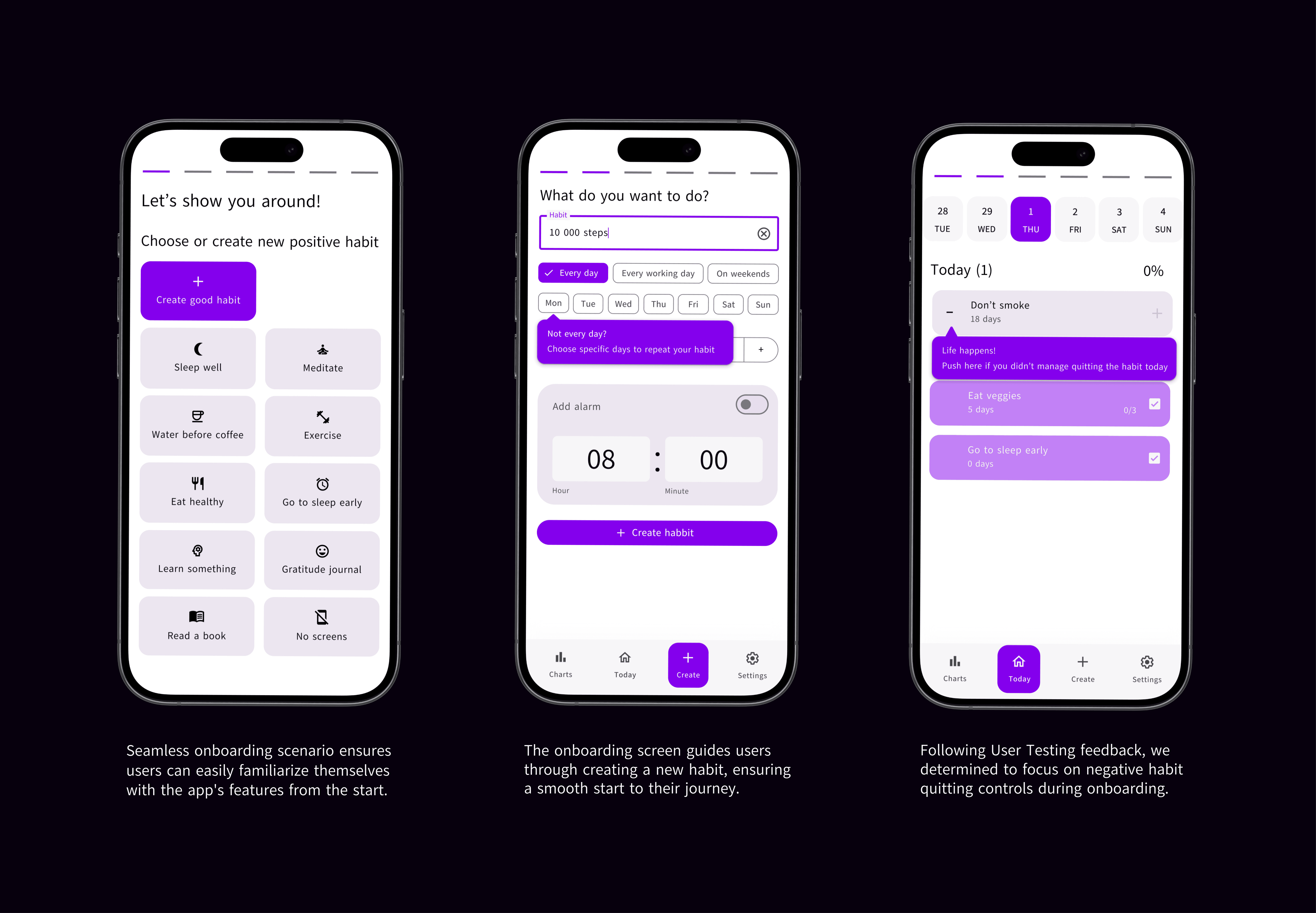
The onboarding scenario was developed with user testing insights in mind to cover the entire user journey. Following User Testing outcomes, it clarified controls for quitting negative habits, as well as introduced users to the different types of statistics offered by the app and how they can be accessed.
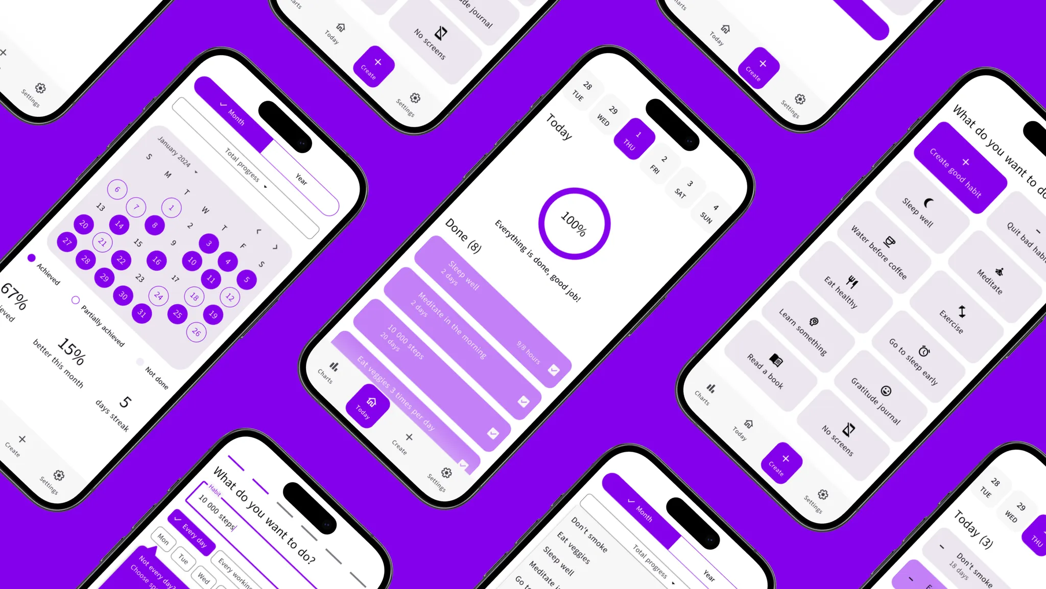
Main page

The primary focus of the main page UI design was on ensuring design consistency, particularly in the creation of habit cards. This involved developing 3 types of habit cards with consistent design elements and unique visual attributes to differentiate between them. Various states were incorporated for each card type to provide users with clear feedback and improve overall usability.
Charts
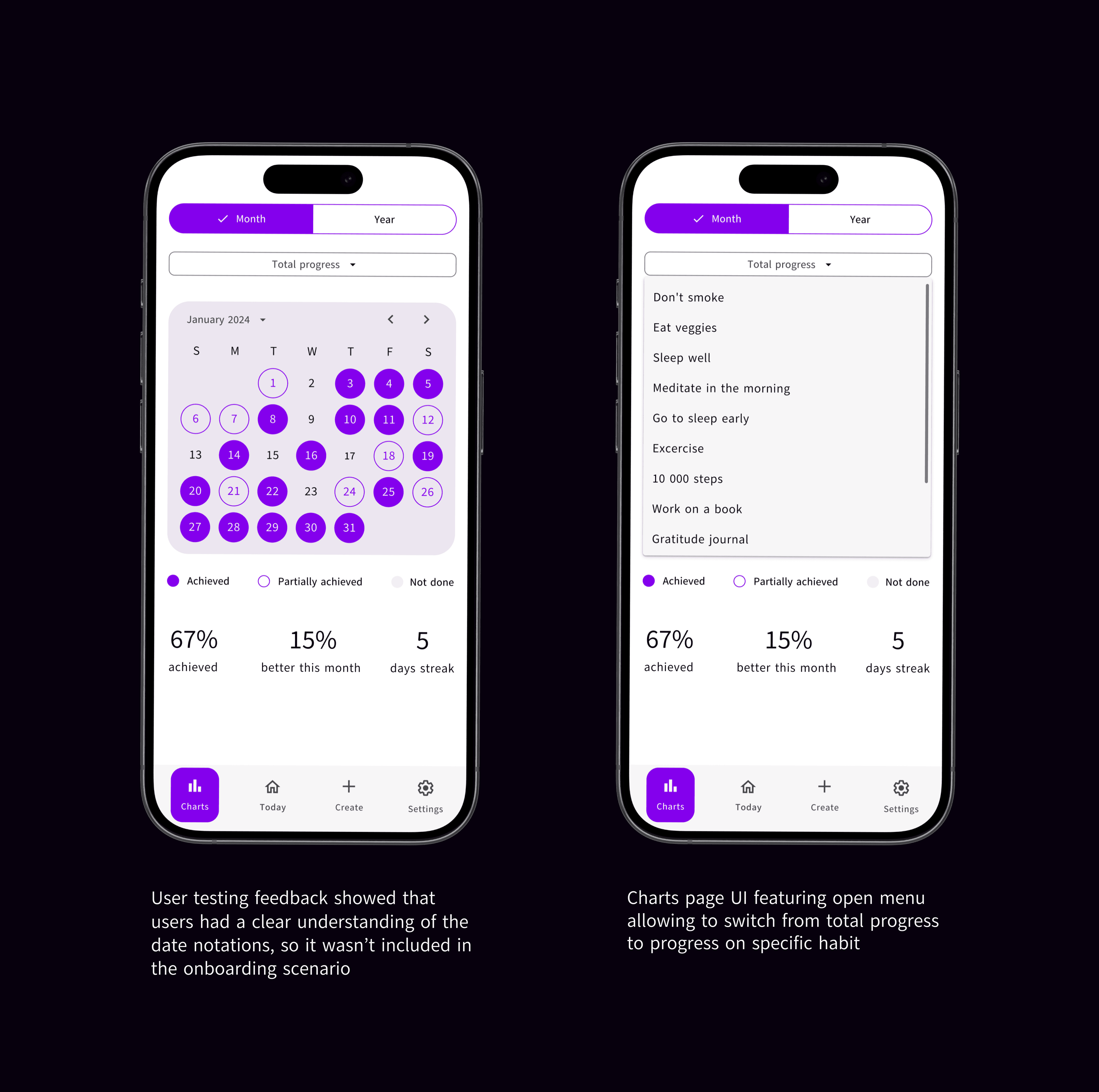
The goal of the statistics UI design was to display the user's progress in a visually engaging way, motivating them to continue using the app and improve their life with positive habits. In line with feedback from user testing, we incorporated two onboarding screens to familiarize users with the various types of statistics offered by the app when they first accessed the tab.
Takeaways
The project's critical tasks, involving iterative UI design improvements with developer input and conducting thorough user testing from scenario creation to result analysis have been successfully completed.
The interactive prototype and design layouts for all screens, complete with descriptions of user behavior are ready for development.
Personally, this project provided me with invaluable experience as I independently executed user testing from generating scenarios and hypotheses to conducting actual tests and analyzing the results.